“Our branding projects shine out through our deep handcrafted design skills rooted in tradition. From the underlying DNA of each letter form, to the dot of every ‘I’, all collateral exquisitely tailored for modern impact,“

What makes us unique?
Crafted Brand ID with Heritage Style
From bespoke typographic design, carving and architectural drawing to you brand front door.
Graduating in fine art and graphics at Camberwell College of Art and London School of Communication Nick has crafted ID statements for clients such as Fred Perry, Le Labo, AstraZeneca, Cocoa Cola and London breweries Fullers and Taylor Walker.
The difference? Roots to fruit
Iconic design leverages new market strategy
Our skills start their journey not from the digital screen but way deeper – from the very root of pure letter creation, classical understanding of spacing and brand mark voicing.
As masters of communication graphics, NGS brand ID (NGS Caslon Branding) bring this deep design knowledge and timeless artistry into the modern, multi faceted brand story.
Authenticity sells: Many brands are seeking authentic, crafted design. Our hand painted lettering & font design skills scream authenticity and feed into all and every project delivery.
We don’t just design logos – we shape head-turning brand presence.
As you can see we have an impressive portfolio and continuing to build business ID for a wide range of clients. Let’s do it for you.
Our Mantra – This is Couture lettering.
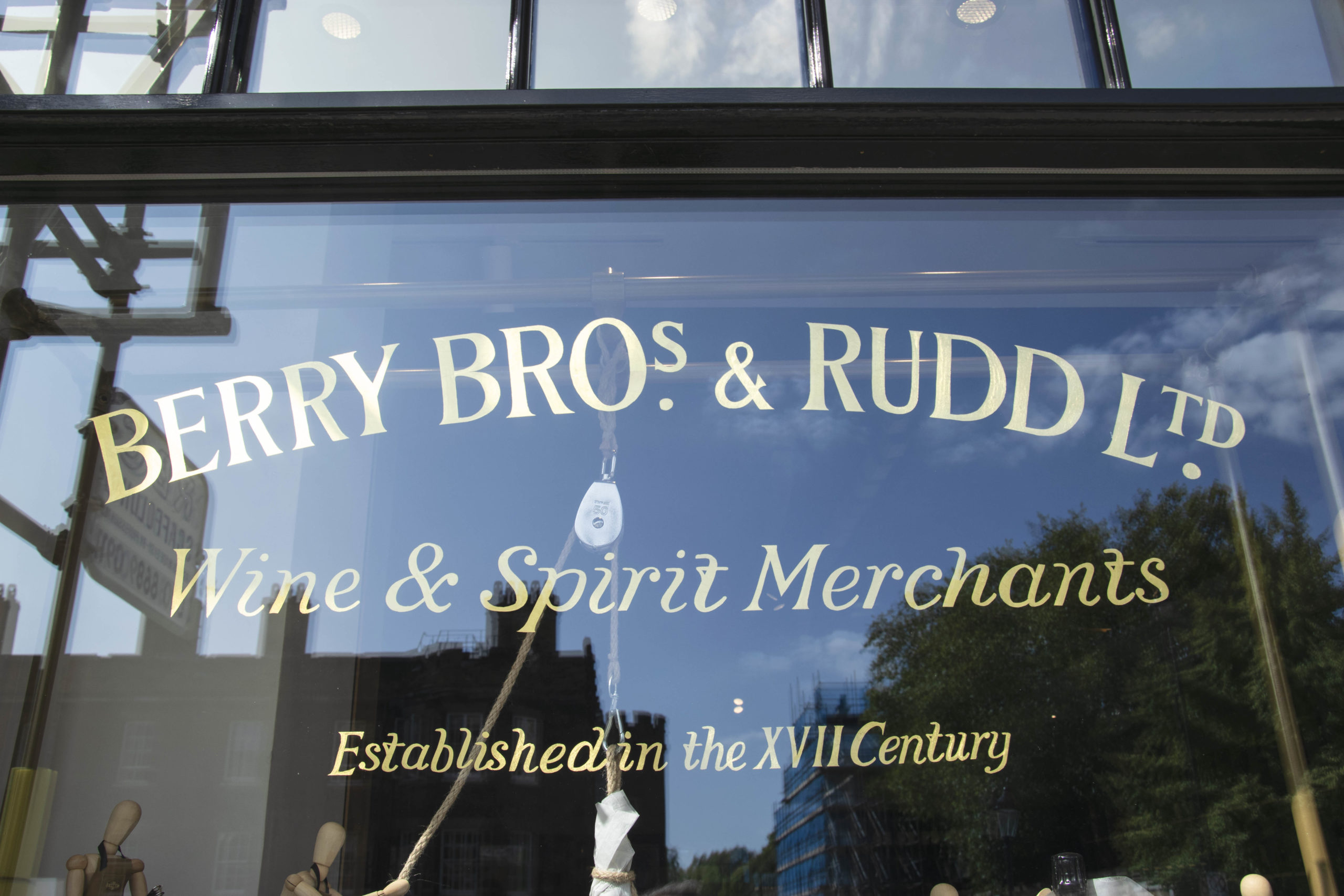
NGS have always made design an absolute priority and brand agencies like Pentagram have come to us for our fine trend leading edge over the past 10 years like the Berry Bros and Rudd project for example.
We not only re-image the old but invent new typefaces, restore classic alphabets, create timeless visual identities rooted in craftsmanship, authenticity, and hand-drawn precision.
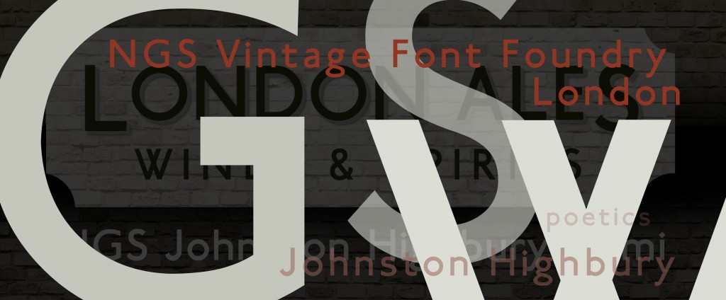
The mainstay of our font design and branding comes from a deep historical knowledge of London typography, the Caslon letter-press in particular, and wider Roman (Pompeian, Trajan) and Swiss (Hass/Gammo) type influences.
Across the past half century of lettering arts, the great signwriters of Britain also shape the shape of our commemorative collection of letters (William Sharpington/Richard Apps).
What Caslon Branding at NGS Offer
I design brands that feel personal, original, and built to last.
Every identity is crafted from the ground up, using skills developed over 30 years as a master signwriter and letterform specialist.
- Brand Identity Systems
- Hand-Drawn Typography & Wordmarks
- Retail & Shopfront Branding
- Brand Style Guides & Asset Kits
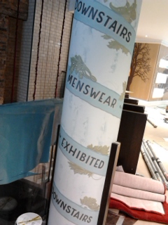
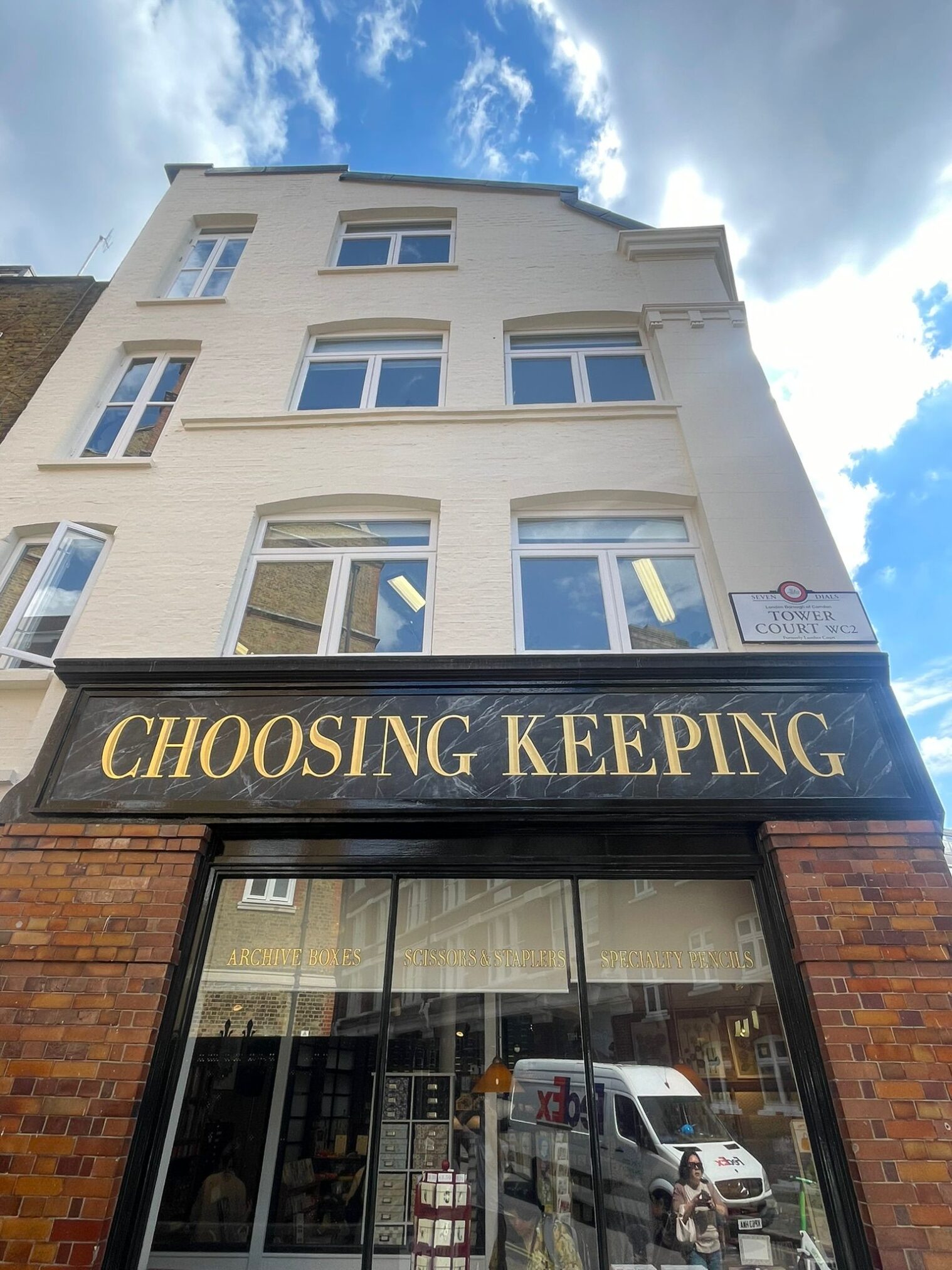
3: Case – Choosing Keeping Store ID
Client: Choosing Keeping, Covent Garden
Industry: Independent Quality Retail / Papers / Calligraphy materials / Books
Objective: Rebrand retail ID for this beloved Covent Garden shop to attract a younger audience while honouring its loyal crowd and heritage foundation.
NGS Branding Process: Explore, experiment, deliver
Discovery & Research builds design empowerment
We explored the full and highly detailed Choosing Keeping concept with founder/owner Julia and spent time in the shop absorbing the characteristics and footfall vibes.
We also looked into any local competitors and found a handful that mainly focused toward a lower market… and we spoke with both new and long-time customers to understand the shop’s nostalgic charm and literary importance to the community.
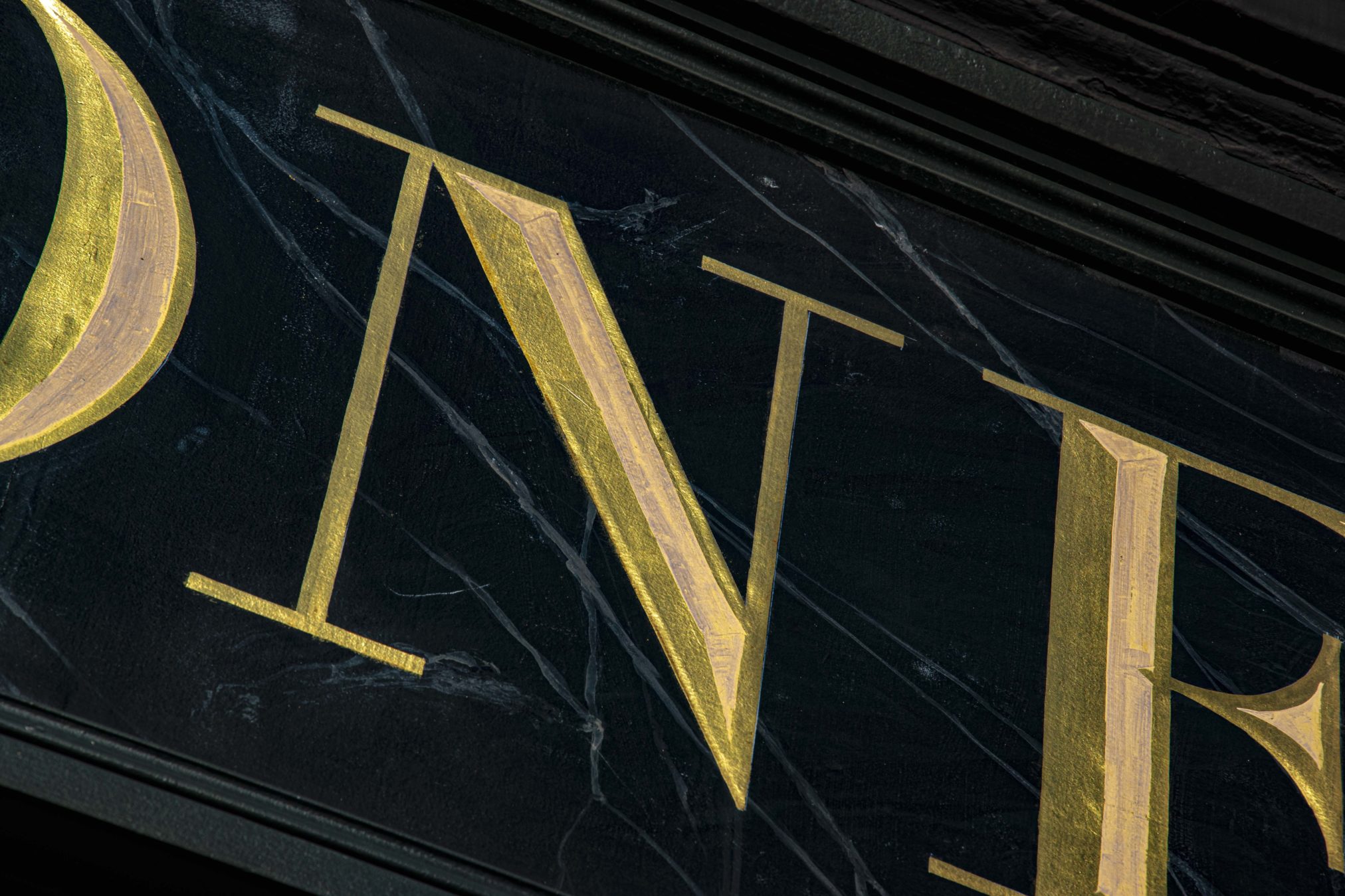
Our custom built Didot Condensed Typography
Using brush-lettering and tall Roman capitals, I developed a set of hand-drawn logotypes, combining classical French Didot with Bodoni and merged these two type giants into the new form: title font forms cut a striking note with truly chiseled iconic clarity.
The background of painted marbling lifted the typography with a rhythmic wonder of nature (creativity itself) beauty.
Logo & Identity Development:
The final brand features:
- A hand-lettered logotype with high contrast and cool serifs
- A monogram stamp for social use and promotional packaging design
- A muted gold leaf-and-cream color palette to reflect the shop’s rich, tactile atmosphere
Brand ID Caslon Branding by NGS
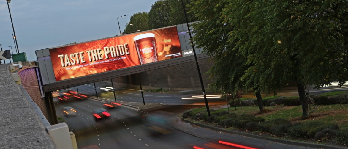
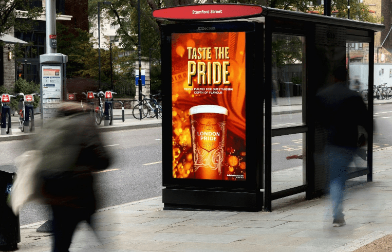
CASE: FULLERS – LONDON PRIDE
Making lush brand design for London’s milestone projects & campaigns
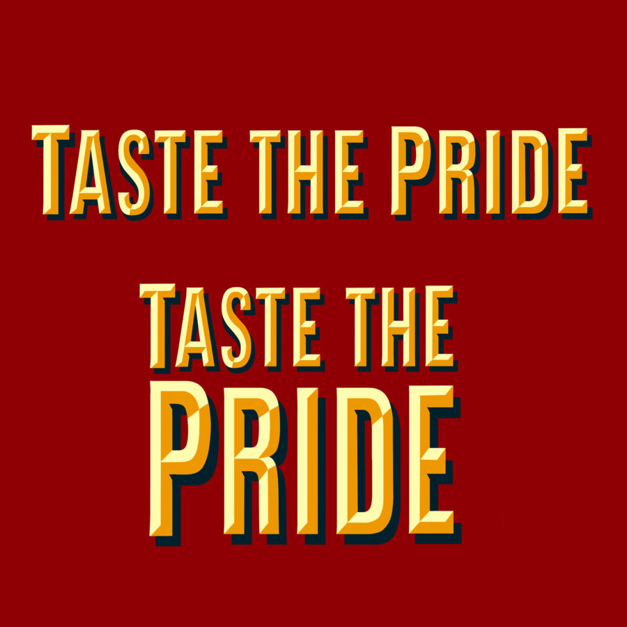
Fullers Brewery London – Taste the Pride campaign
Cocoa Cola’s in-house Type face design
Roll out type and font design for major global campaign
Neon Creative
Working with Neon’s Dana Robertson for leading wine merchant on a series of 12 decks.

4. More about our Hand Brand and Bespoke Font Foundry
As part of our service we offer complete brand ID and font development alongside graphic and logo design and refinement.
Working on a host of client ID updates over the years has invited the attention of the design industry including Cubos, Pentogram and many others.
It’s always a privileged working with the best and here are some of our recent commissions and a bit about the journey.
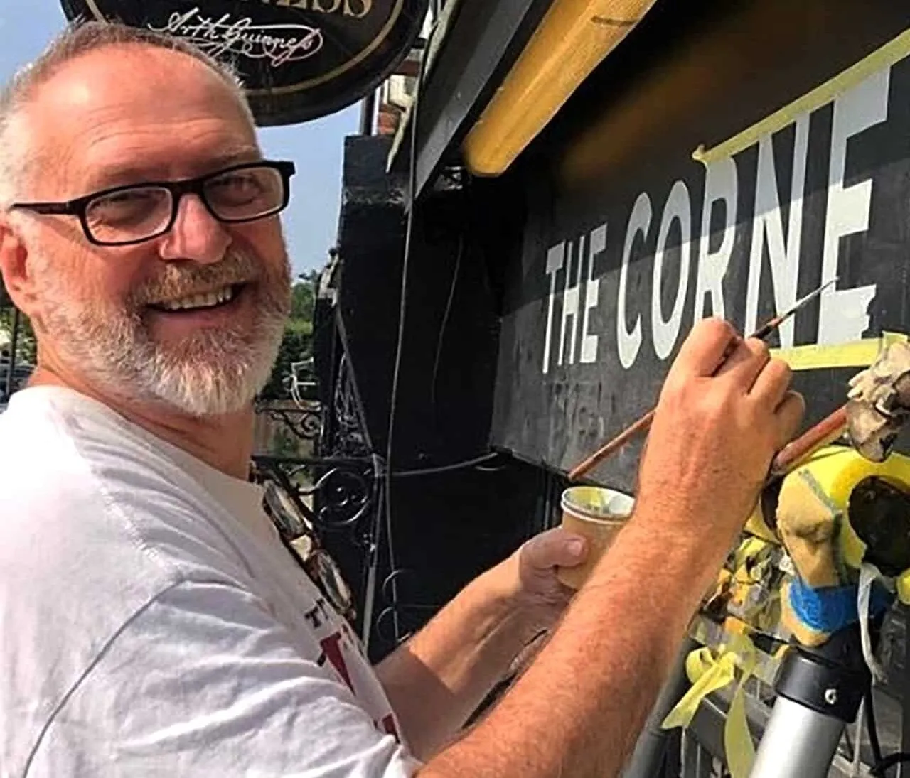
Nick Garrett

Adam Baille was stuck on a design motif for over 2 years – coming to us he exchanged ideas and we ended up with this blend of hand finished feel for his corp ID.
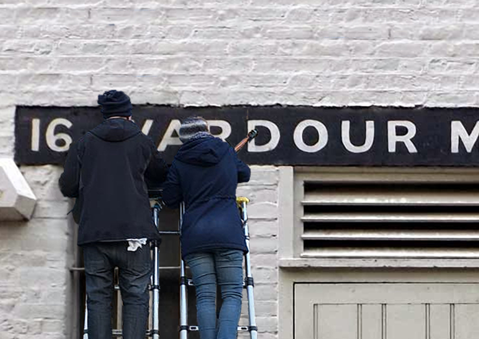
5. NGS Johnston Highbury – font restoration and research
As you can see we gather ideas off the milieu of London walls.. Roman artefacts and our trsuty
sketchpads.
On the back of working with Sawyer and Gray of Islington, we reset our very own original version of Edward Johnston’s famous type. No frills just all the original spills and his very own eccentricities included for a truly beautiful typographic voice.

NGS Logo marks

OV Silver Vaults came in with a rough sketch which we converted and refined into this hand scribed logo.
The creative process included freehand Roman calligraphy, brush work and final deck in full vector formats.
Love Hate Social Club – Miami Ink


Signage designed for Miami Ink – London HQ required c6 months of refinement and the final result became an iconic mark for these incredibly talented Ink artists.
McDonalds UK

Grid murals for Damien Hirst
Not exactly brand but had to be included for it’s graphic precision… 126 sqm mtr of perfectly executed linear graphics in 13 fantastic Tate days.


Ted Baker Vintage brand design
Lining up some vintage themes for TB prime Brompton Rd. retail interior, posters and retail POS packaging. A design going on to influence wide range graphics for TB.