Our
Fab ‘Trad Mix’.
With a dash of Modern.

From the Coolest New Minimals.
To the Hottest Classics.
WE GOT YOU
The Top Brands trust us.
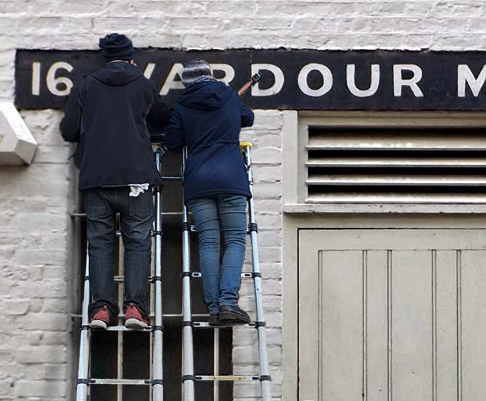
+40 years of pure sign design experience.
No Better Letters. London’s best dressed Signs.
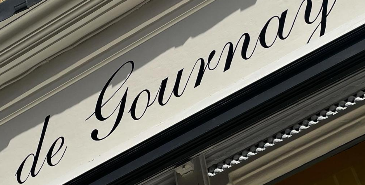
‘Rather splendid!’
Claude De Gurney. CEO of De Gournay fine wallpapers.
THat’s just so cool
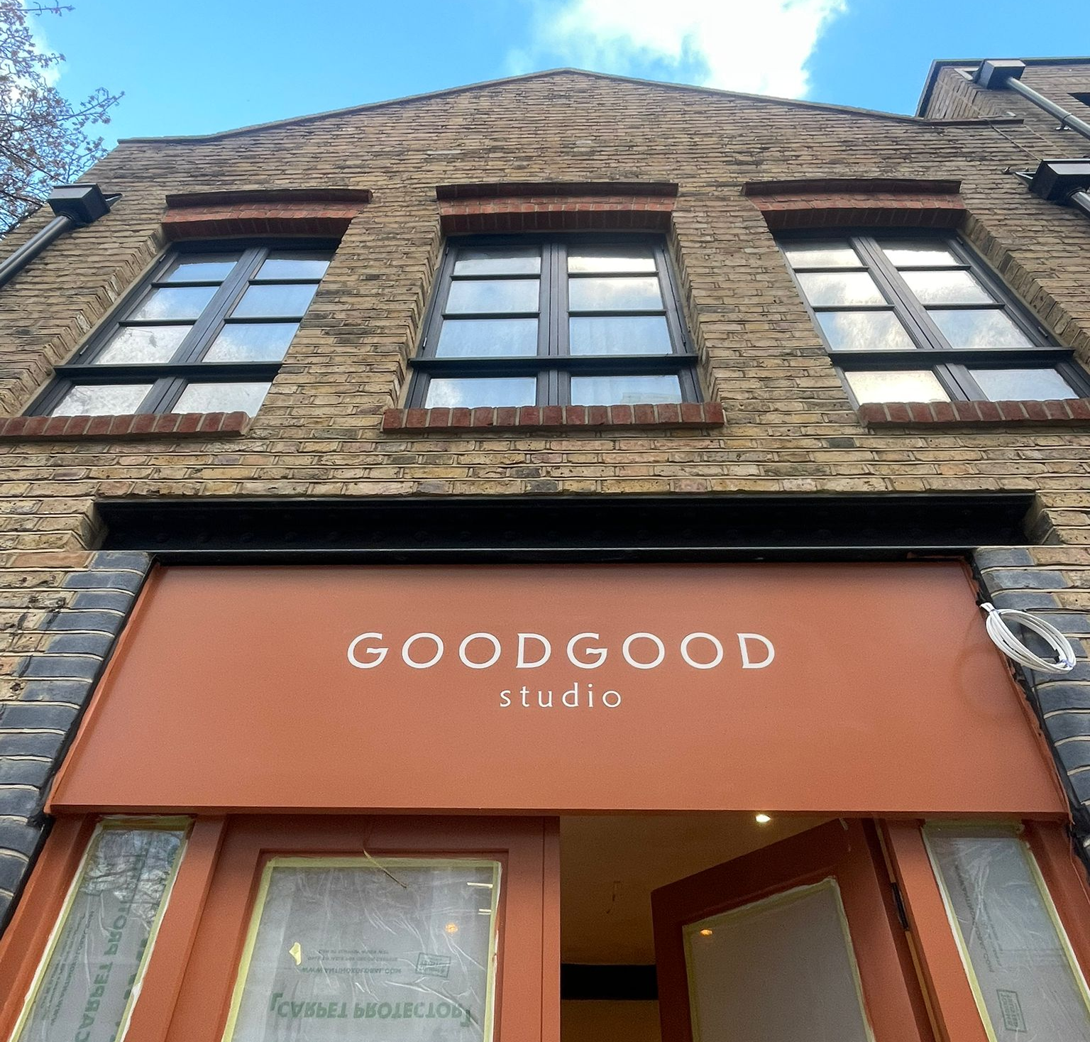
GoodGood Studio Wimbledon London.
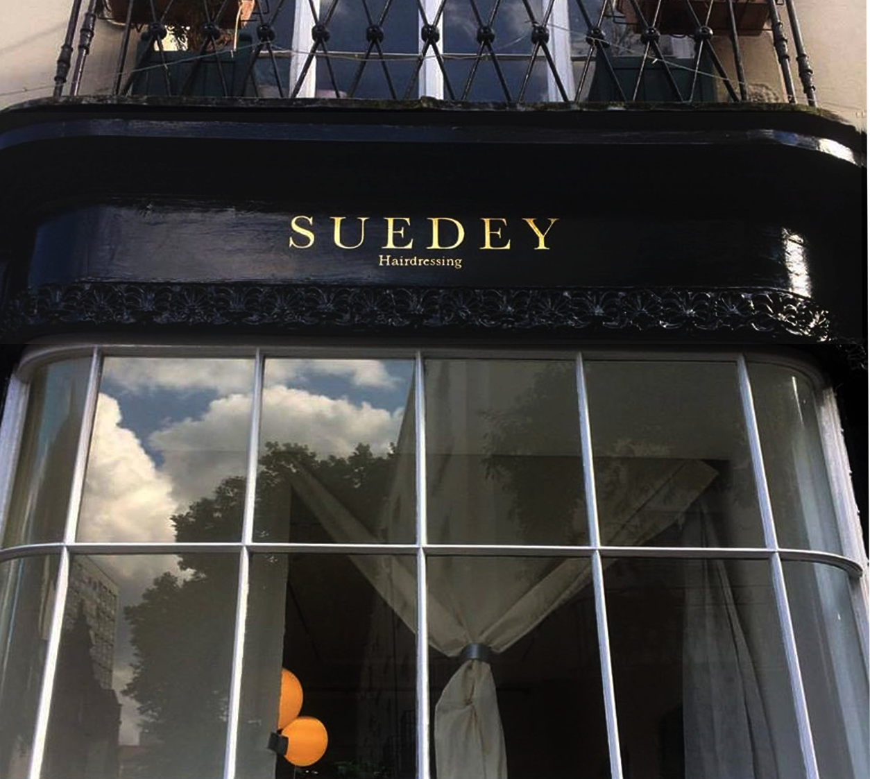
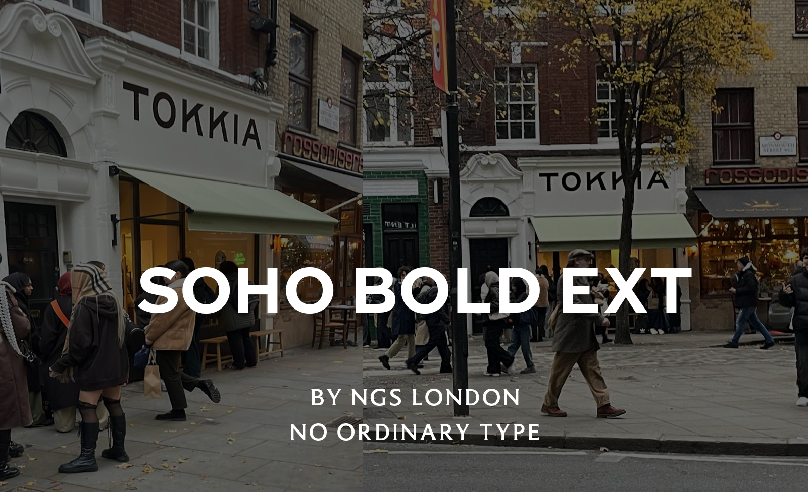
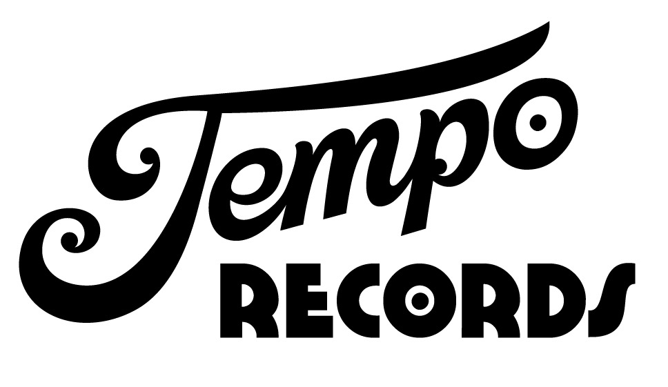
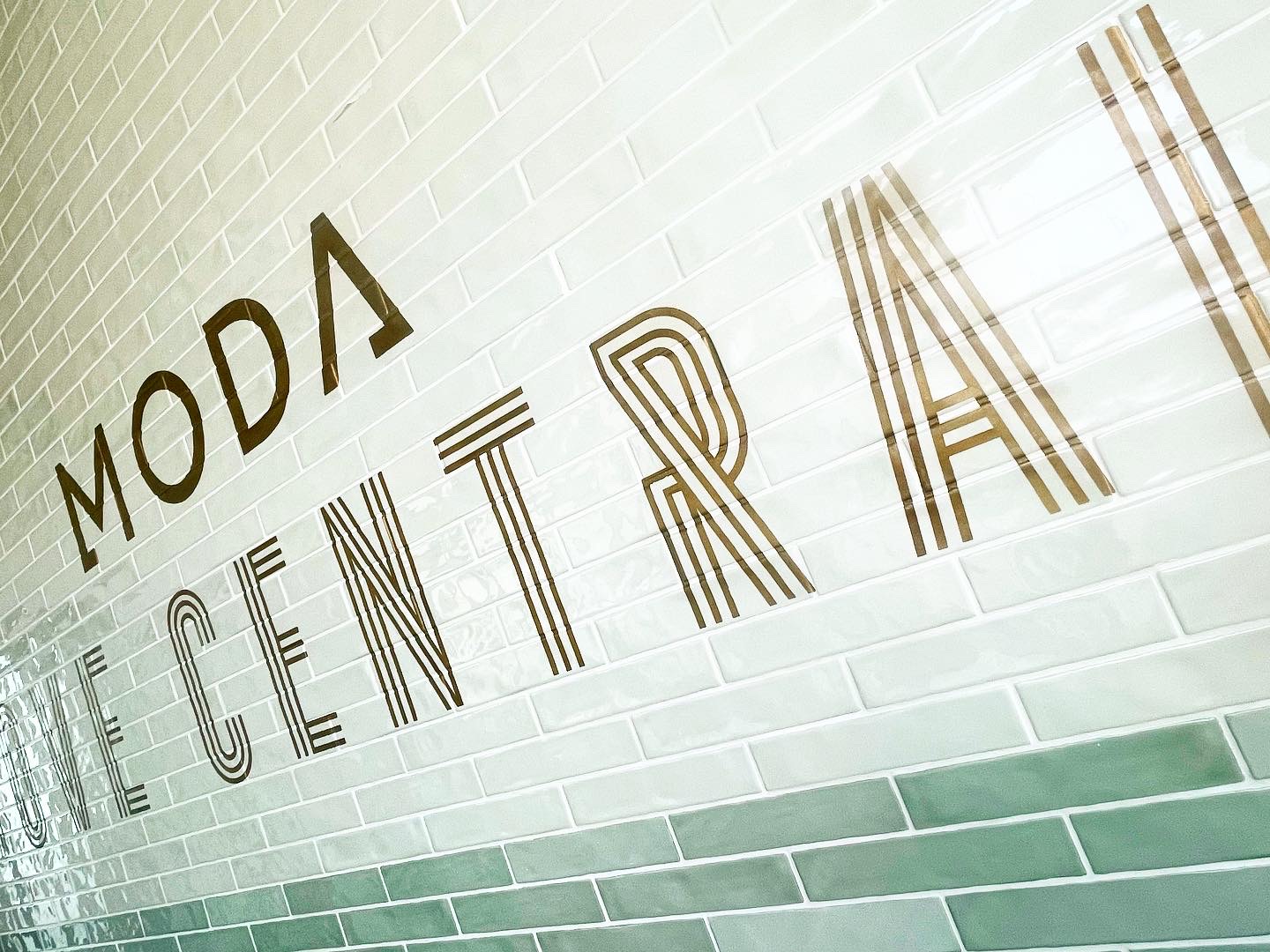
Trad Twist mix NGS Soho Retro FONTS
PART 2: OUR CUSTOM MADE FONTS
A great RANGE of contemporary SOHO retro classic FONTs JUST FOR YOU.
Our ability to make the ‘Old World Delights’ come to Life! Shown on this page and across the site using our Bespoke collections of London Vintage Roman, Soho and Docklands typefaces.
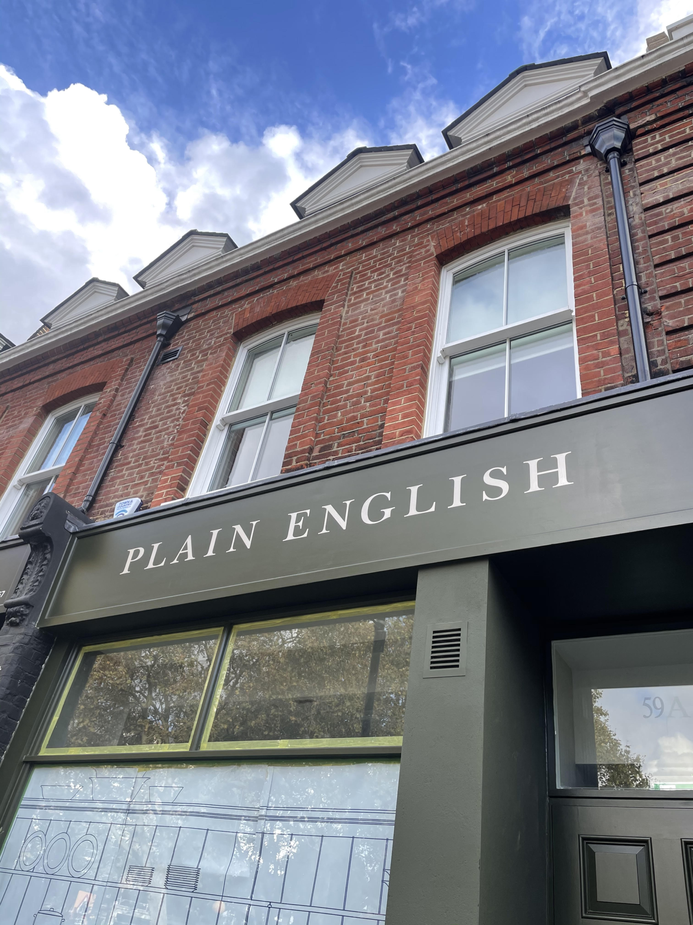
PLAIN ENGLISH OR FANCY STUFF?
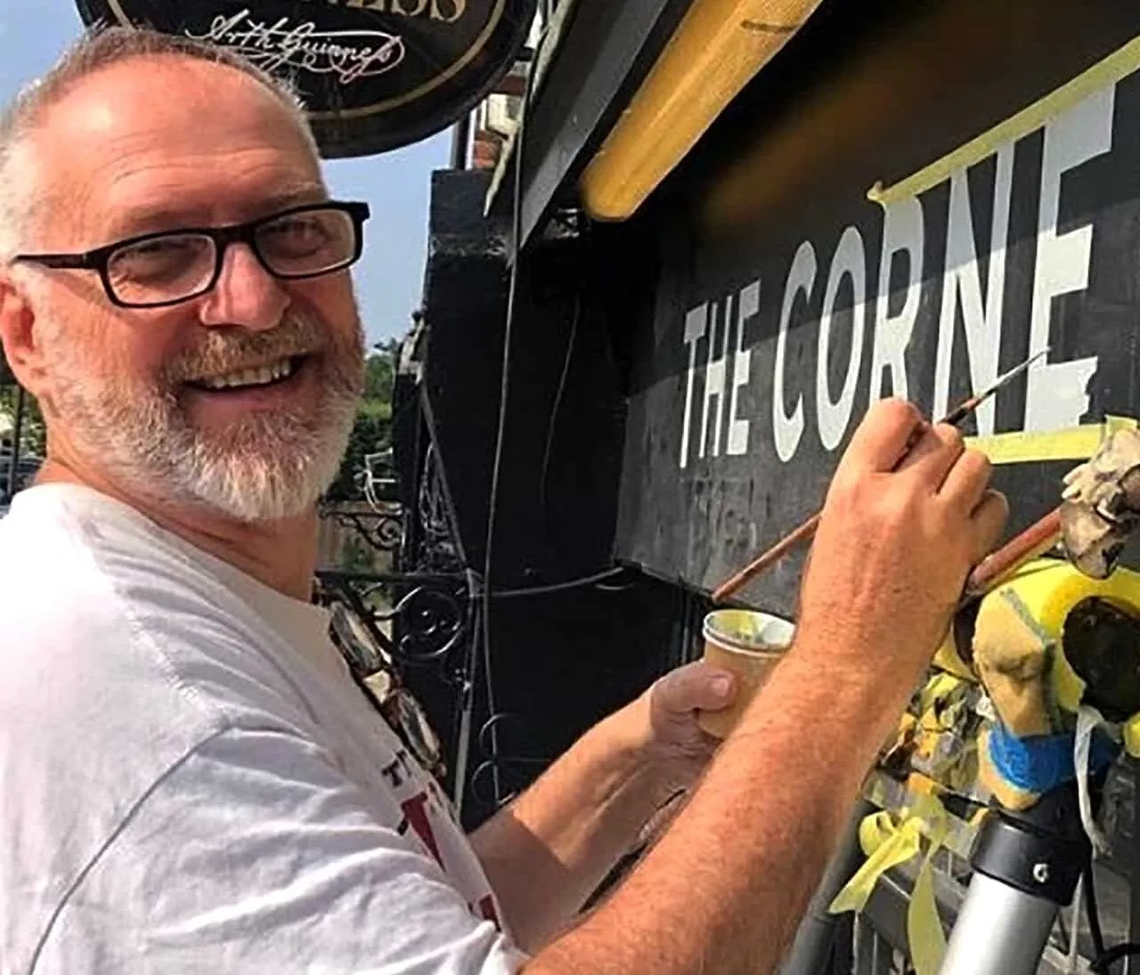
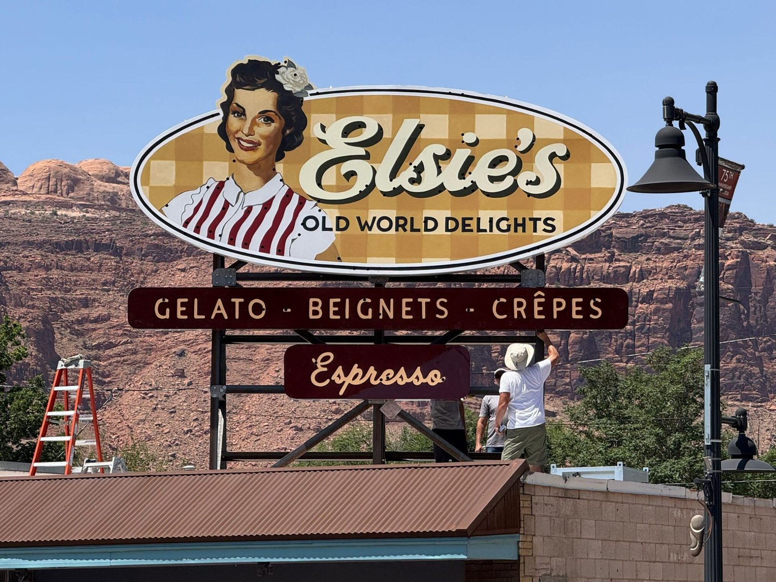
Below: NGS 2025. Designing and painting this 5m wide neon back board for new cafe ”Elsie’s” in Moab, Utah, US.
TIMELESS, EXOTIC, DRAMATIC…
JUST PLAIN FUN BY DESIGN
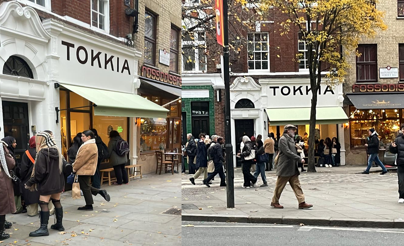
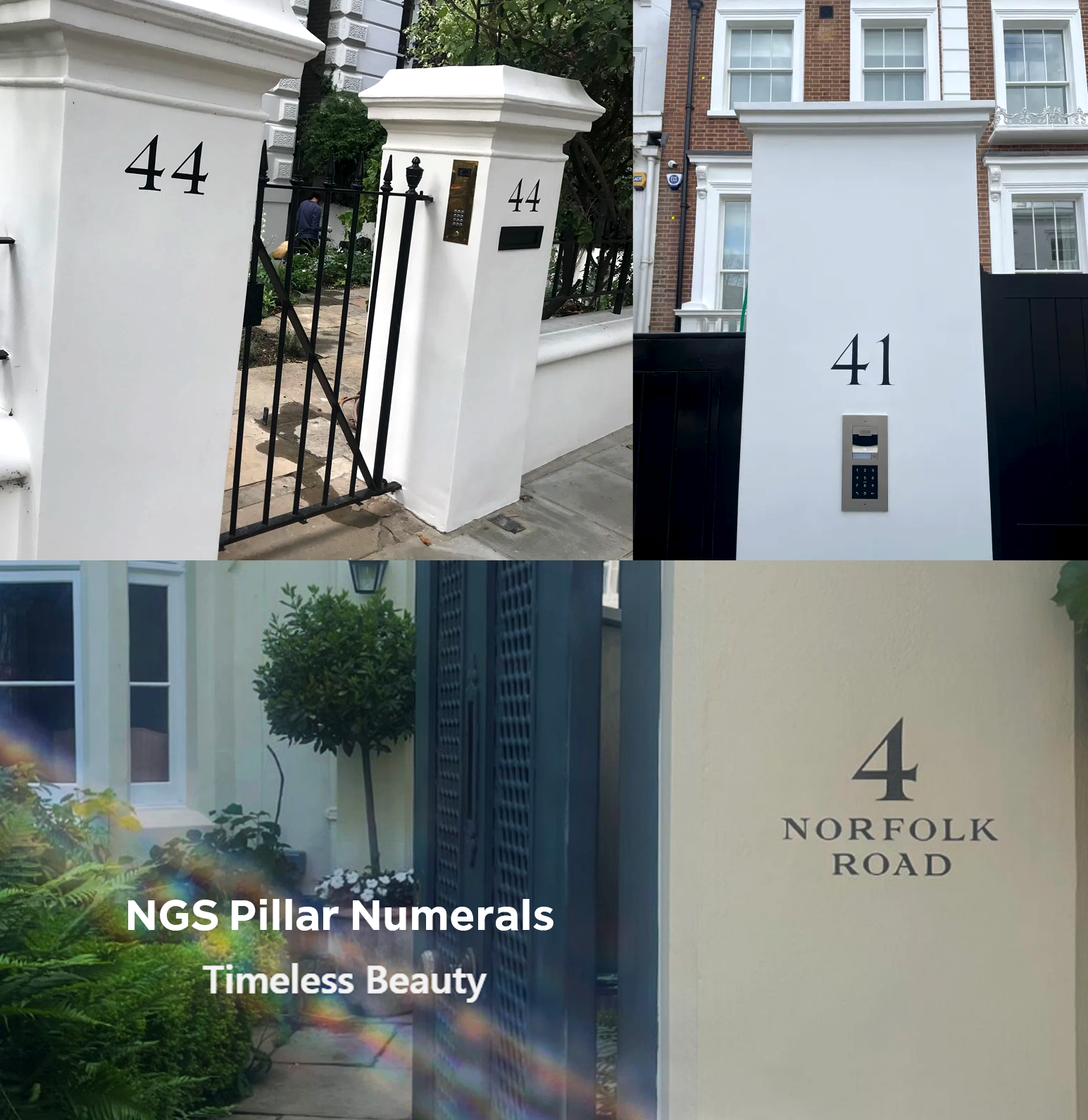
NGS make the widest range of Pure By-Hand Brand Sign Designs
A true twist mix of lettering is what we do. Yes we can create classics for Barbour or Penhaligons, switch to Urban rustics for Le Labo and whatever else you can dream up.
We’re equally happy assisting and faithfully replicating your own design material or you need us to help create your brand ID.
The results are always strikingly beautiful, prompt and above the quality lines.

PART 3:
CREATING NEW SIGN GENRES & STYLES
WE MAKE ‘NEW CLASSIC’ SIGNS
For a new Legendary London
deserving of
NO
ORDINARY TYPE
“Fashions fade
style is eternal”
Yves Saint Laurent
PART 2: STYLE
STYLE OUTSHINES ALL FAD AND FASHION
It’s easy to taste the allure of new splashes of fashionista design trends… they instantly appeal, sugar coated, transient, beautiful, and are just plain yummy eye candy, nay addictive!
We all still love genuine, crafted, High Street design.
NGS
Finding all our clients a dynamic High Street edge – Nick Garrett
Today, almost instantly, uber sweetened Ai design styles seek to become meteoric rising stars, and often suffer from over saturated graphic plasticity.
With Insta and Tic Tok coverage everything is seemingly hyper real yet inhuman.
As a product designer for 20 years my job was and still is, to tap into new design trends and round table new ideas to my team/clients/partners.
As a veteran product designer, my job involved walking the exhibition floors of the world, in order to coherently barometer and table reports on new trend, and what was happening 360 in the industry. I then had to deliver design direction to my team which often numbered 20 makers and finishing artists and dozens of suppliers.
It was my job to deliver: out of very traditional training background of a fine art degree, to become a turnkey retail trend product development head.
Designing a powerful, successful sign relies on a strong understanding of local cultures and tastes…
Specifically for manufacturers, importers and large retail groups such as Habitat, Crate and Barrel and Next – my teams created annual graphic/product ranges that out-paced competition, and set new trends.
Success reliant on the constant of coal face artworking, testing modifications and a deep analogue design understanding.
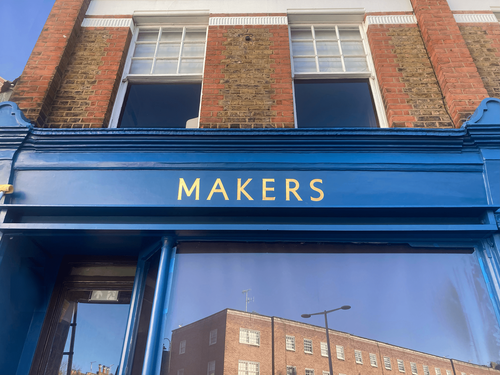
”When you come to NGS, you’ll get the mix of past traditions, dipped into a clear, timeless, look and feel”
”NGS designed our SURETECH logo and within days our business was transformed!”
Oliver Taylor CEO Suretech
Our strategic, winning edge design is the extra you’ll absolutely treasure.

ON THE INSIDE: OUR DESIGN PROCESS
Depth, research and specialisation.
I crafted and chiselled away at my craft based design skills, areas of deep interests. I found my everyday work return to the tip of a fine, pointed sable brush.
As a masterstroke signwriter and graphic typographer, I found myself drawn to the raw facades of London. I was mixing paints in the winter cold and summer smog, alongside the new Shoreditch street artists, amid a capital breathing revival and a new creative agenda toward ‘by-hand’ and new era digital creativity alike.
“Fashion you can buy, but style you possess. The key to style is learning who you are, which takes years. ”
Iris Apfel, American interior designer, and fashion designer, known for her flamboyant style, outspoken personality and oversized eyeglasses.
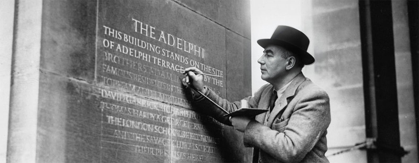
Graphic design fell into categories of sharp fashion, right through the growing ranges into the historical archival alphabets, which were birthed in deep antiquity (200 BC), to mid century and the more recognisable modern day brand design era (1905 – London Underground – Frank Pick influence).
William Sharpington
Today those ‘lives of lettering artists’ from the 1st century to mid century, and their wonderful shapes are presented here. Reflective, gracious, and time honoured… yet always convergent, dipped in freshness of London’s future trends and styles.
Nick Garrett. NGS
PART 4:
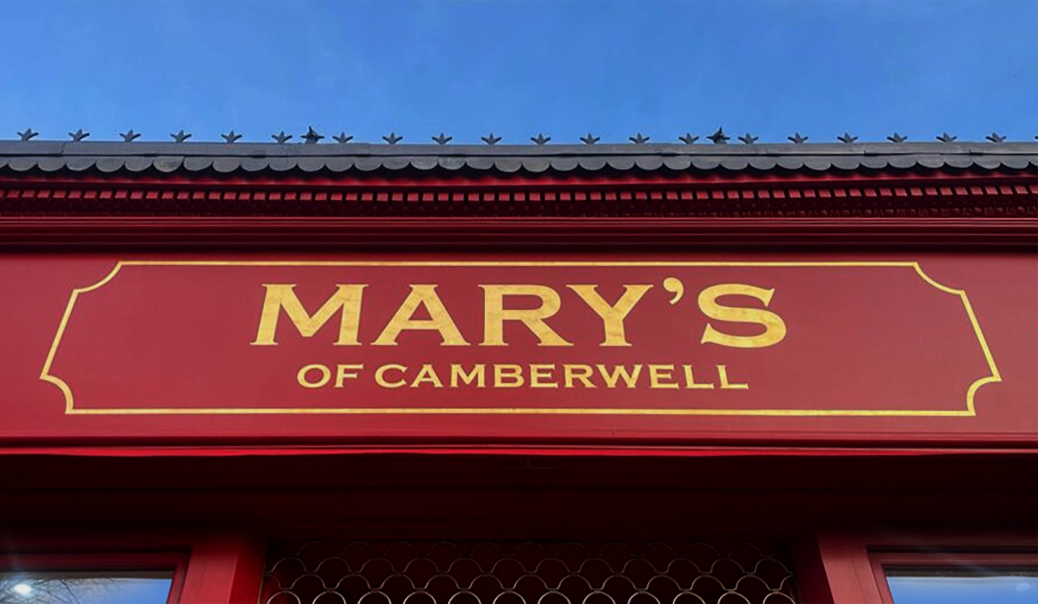
CLASSIC LONDON TYPE
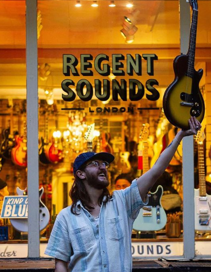
Gill Sans Bold Condensed for Regent Sounds and
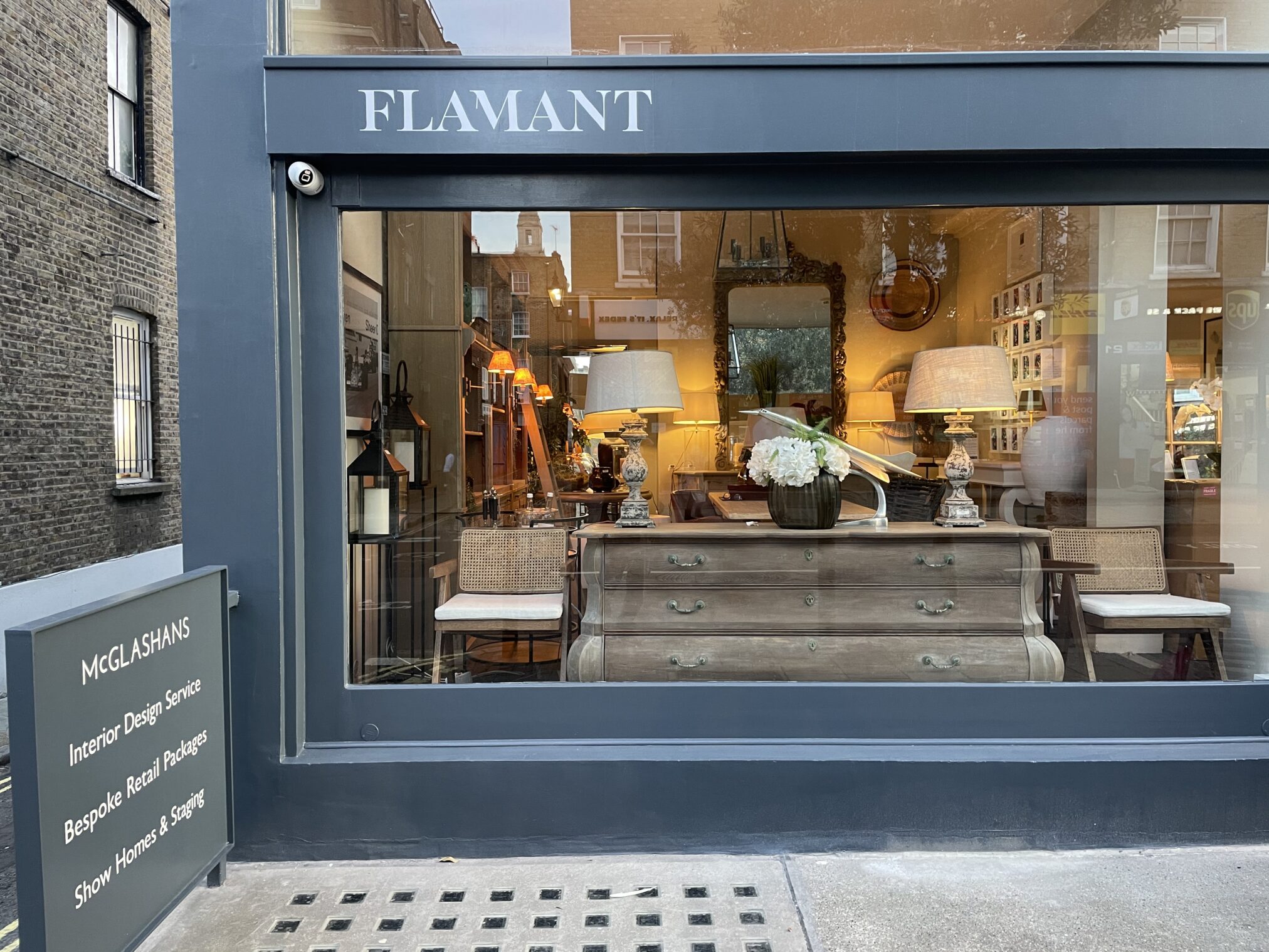
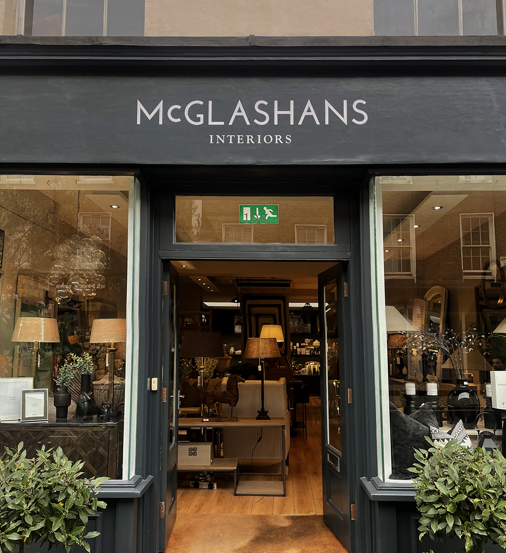
For McGlashan’s we noted their desire for Baker St/Marylebone heritage and era mood. Our fine tuning included polishing kerning and introducing some micro characteristics found in the Baker St. station heritage Johnston signage.
We call Baker Street our typographic ‘Johnston museum station’. It’s featured on our APP, adorned with original signage typography in situ in that fabulous station.
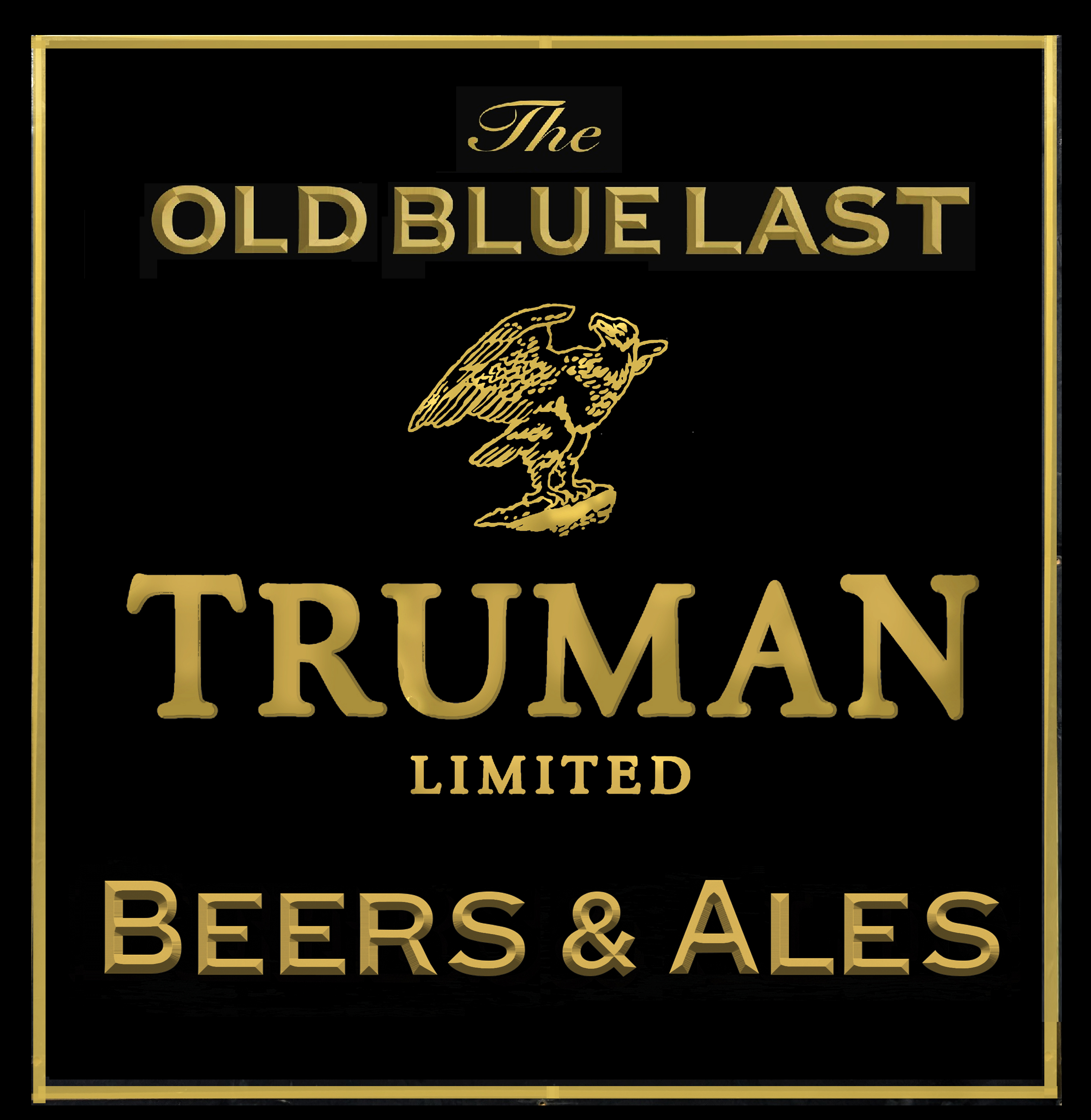
NGS Copperplate in Red & Gold
NGS Copperplate in Red & Gold
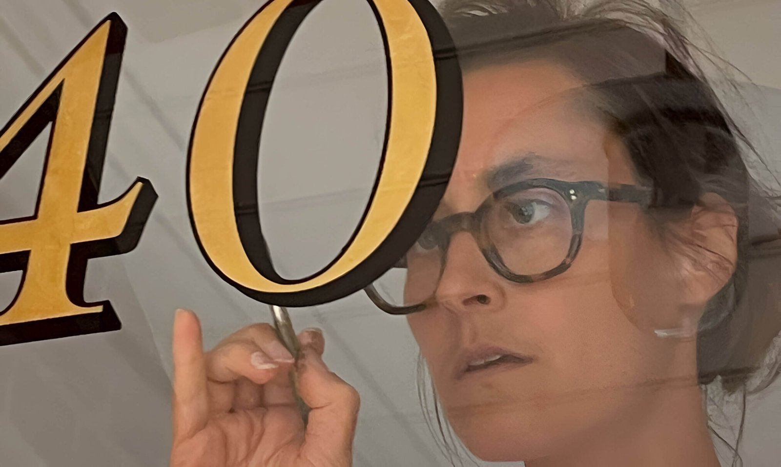
NGS: BY HAND ACCURACY & BEAUTY
Creative Style and Typographic Design PERFECTION
PART 5:
Sometimes rather Plain.
always rather Beautiful.
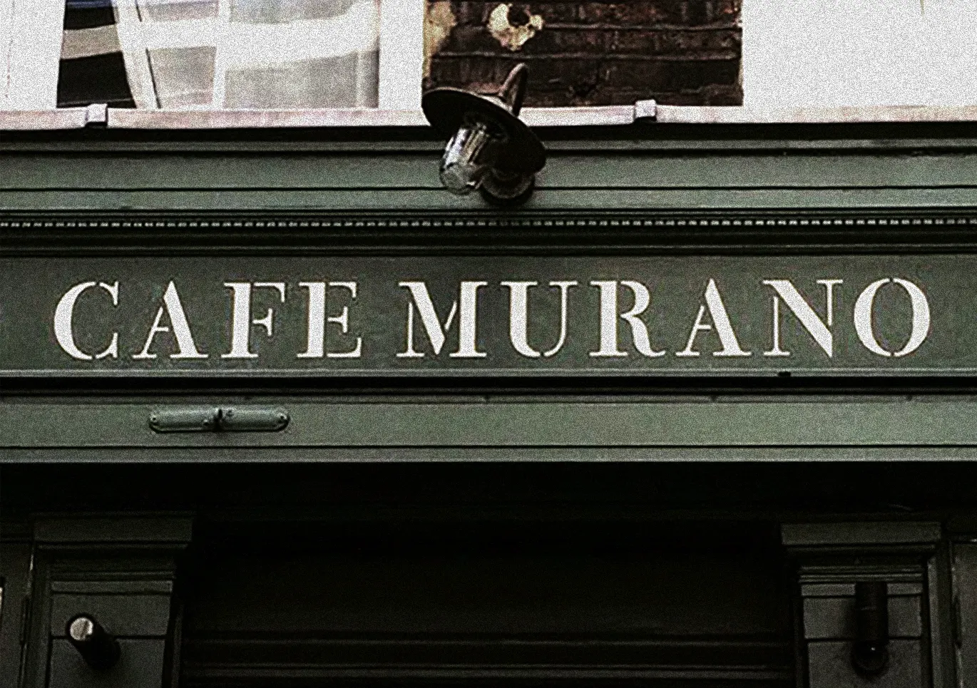
Incised Bodoni in Velatura Gold
Incised Didot and Bodoni Font
for the astounding ‘Choosing Keeping’ shop, Covent Garden, London.

and for Home
A DEPENDABLE MIX OF THE BEST FONTS AND IN-HOUSE aRCHIVAL LETTERING DESIGNS
French and Italian Trajan-Didot Typography flavours, mixed with our Stylish Classical London themes, and inspired vicinity Heritage Signs.
THE CLASSIC DESIGN MIX MASTERS
WE ARE LONDON LETTERING aRTISTS
(with a slice of Trad-Twist mix, NGS Soho Retro and NYC Boho panned in!)
HOT VINTAGE SIGNS NOW SERVED
WITH A COOL MODERN TWIST...
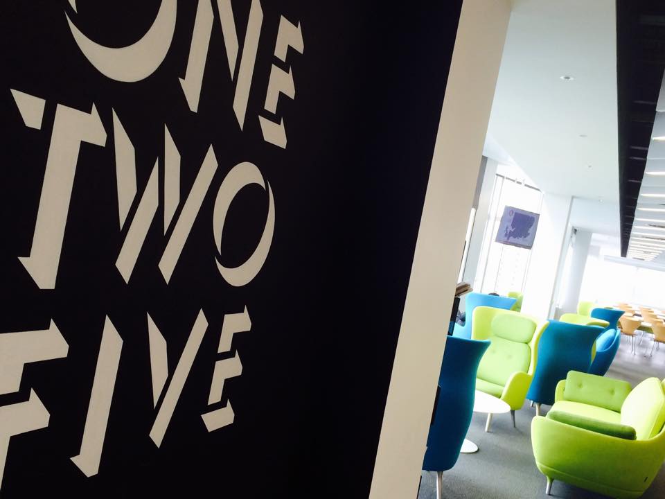
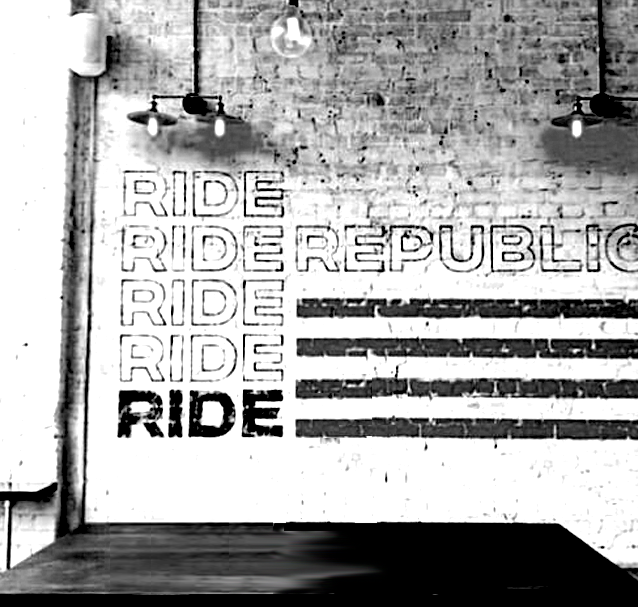
Above: Interior Wall Signage | Gill Sans Light with Bold Drop Shadow | Bone white.
WHY ‘FREE FONTS’ ARE A NO NO…
We never just take a ‘free font’ and jazz it up.. it just lacks design power and integrity.
We check all the fonts clients fwd our way. Often we suggest a ‘balance out’. Then we fix them or redcreate an original top notch NGS Font.
These are then hand-painted to the final lettering layout – always incredibly carefully spaced and stylishly scaled.
Whether a rich old school cool vintage classic sign,
or fresh, joyful minimalist,
Sign things are made differently here.