This article is an edit and patch piece with useful links and background to the Venetian classics – Nick Garrett

Aldus Manutius
All rivers lead to Venice
Venetian/Aldine: Because of its location and status as a center of trade, Venice also became the focal point of type design and printing in the late 15th century. The most influential Venetian work came from Aldus Manutius, a printer and publisher whose books were renowned for their authoritative scholarship. As they also were of the highest technical and aesthetic quality of their day, they were in great demand, and the typefaces they employed were widely copied by other printers.
The leading publisher and printer of the Venetian High Renaissance, Aldus set up a definite scheme of book design, produced the first italic type, introduced small and handy pocket editions (octavos) of the classics, and applied several innovations in binding technique and design for use on a broad scheme.
He commissioned Francesco Griffo to cut a slanted type known today as italic.
He and his grandson Aldus Manutius, the Younger, also a printer, are credited with introducing a standardized system of punctuation.
Imprint and motto

In 1501, Aldus began to use, as his publisher’s device, the image of a dolphin wrapped around an anchor. His editions of the classics were so highly respected that almost immediately the dolphin-and-anchor device was pirated by French and Italian publishers. More recently, the device has been used by the nineteenth-century London firm of William Pickering, and by Doubleday. Aldus adapted the image from the reverse of ancient Roman coins issued during the reigns of the Emperors Titus and Domitian, AD 80–82. The dolphin and anchor emblem is associated with “Festina lente“ (Hasten slowly), a motto that Aldus had begun to use as early as 1499, after receiving a Roman coin from Pietro Bembo, which bore the emblem and motto.
http://www.leonardo-ambrosiana.it/en/aldo-manuzio-in-ambrosiana/
Griffo Typefaces
For his series of pocket-sized editions of the classics, Manutius designed a new font in which the letters were inclined which he called “italic” in reference to classical Italy. Despite trying to have the font patented, he could not stop printers outside Venice from copying it, leading to the font’s popularity outside of Italy.
Type designs based on work designed by Francesco Griffo and commissioned by Aldus Manutius include Bembo, Poliphilus, Garamond, and Hermann Zapf‘s Palatino and Aldus.
Aldus

Greek classics
Aldus’ most important type, designed by Francesco Griffo, was created for a 60 page essay by Cardinal Pietro Bembo, in 1495. The typeface, called Bembo after the manuscript’s author, was a Roman design of great typographic significance. Its popularity spread throughout Europe and remained the major influence in type design for the next hundred and fifty years. All of the type designs which we call Old Style can be traced back the design of Bembo.

Pocket books, the birth of the Italicised Roman
Among Aldus’ many innovations was publishing personal versions of the classics in a small format which was easy to carry. Books of that time were very large, usually read while being supported by a lectern. Aldus correctly recognized a market for a smaller, easily transportable book which would fit conveniently in a pocket or saddlebag.
These, the forerunners of today’s pocket-size books, utilized another of Aldus’ unique innovations. They were printed in a new style of type which he commissioned from Griffo. This type, patterned after the official cursive hand of scholars and professionals, called cancellaresca, was designed at an angle, carried a distinct flavor of handwriting, and featured smaller character widths.
This typestyle, the first italic letterform, allowed for more characters per line than the Roman style, thus fitting more text to the smaller page format of his personal books. These books were enormously popular and had a profound effect on education and the diffusion of knowledge.
A twentieth century revival of the Venetian types, Bembo is a copy of the Aldine Roman typeface cut by Francesco Griffo.
Typeface: Bembo
|
Bembo
A twentieth century revival of the Venetian types, Bembo is a copy of the Aldine Roman typeface cut by Francesco Griffo.Bembo is a classic typeface displaying the characteristics which identify Old Style designs:
A good type choice for expressing classic beauty and formal tradition, it reads well in large amounts of text and is an excellent book face. |

Bembo is a classic typeface displaying the characteristics which identify Old Style designs:
- minimal variation in thick and thin stroke weight
- small x-height
- ascender height exceeding cap height
- oblique stress
- short, bracketed serifs with cupped bases
- angled serifs on lower case ascenders
A good type choice for expressing classic beauty and formal tradition, it reads well in large amounts of text and is an excellent book face.
Later French influences
French/Garamond: By the 16th century, France became a leading influence in printing and typography. The most popular type designs of the time were those of Claude Garamond, who was heavily influenced by the Aldine types. As Aldus Manutius was an innovator in publishing, Garamond was certainly innovative in his type designs. While the typographic form was basically a copy of hand lettering, Garamond was perhaps the first to consider the qualities of letterform design as distinct from earlier manuscript styles. Thus his designs, while based on the Venetian types, introduced subtle and delicate refinements: more open lower case characters with generous counters, larger capitals, and a delicate grace to the curved strokes.
While these refinements are subtle, they nonetheless produced type which was at once more graceful and inviting to the eye than the popular Aldine Roman. Garamond’s type was a great success and became so widely accepted that it is considered to be the final deathblow to the Gothic letterforms. Many contemporary variations of Garamond continue to be among the most widely used typefaces today.
Garamond’s innovations established many of today’s typographic conventions. His appreciation of the Aldine italic was such that he felt it to be a suitable complement to all of his Roman types. Thereafter, for each roman typeface he created, he also designed a complimentary italic style. This concept was so universally accepted that the italic became a standard variation to Roman types.
Garamond also established the concept of the commercial type founder. Since the time of Gutenberg, custom dictated that printers design and cast their own types. They also manufactured their own paper, and formulated their own printing inks. When a printer created a particularly popular typeface, other printers were quick to copy the designs for their own typecasting.
Whether Garamond wished to preserve the integrity of his own designs, or merely make additional profit is not known, but he initiated the practice of casting his types for retail sale to other printers. This eventually led to the establishment of independent businesses which were exclusively devoted to the design, cutting, and casting of type for sale to the printing trade.
These establishments, called typefoundries, became sources of type for many printers and were instrumental in the widespread acceptance and distribution of new designs.
Typeface: Garamond
|
Garamond
Garamond remains one of the most popular text faces today. It is highly readable, lends a graceful quality to text, and its long ascenders give it a light, airy quality. |

Influence in the modern era
Manutius’ name is the inspiration for Progetto Manuzio, an Italian free text project similar to Project Gutenberg.
The novel Mr. Penumbra’s 24-Hour Bookstore by Robin Sloan features a fictionalized version of Aldus Manutius, as well as a fictional secret society devoted to him. One of the novel’s characters, Griffo Gerritszoon, designs a fictitious font called “Gerritszoon” which is preinstalled on every Mac, in allusion to Manutius’ associate Francesco Griffo, the designer of italic type.
Aldus, a software company founded in Seattle in 1985, that created PageMaker for the Apple Macintosh, is named after Manutius and used his profile as part of their company logo. Aldus was purchased by Adobe Systems in 1994.
Altsys and Aldus FreeHand
In 1984, James R. Von Ehr founded the Altsys Corporation to develop graphics applications for personal computers. Based in Plano, Texas, the company initially produced font editing and conversion software; Fontastic Plus, Metamorphosis, and the Art Importer.[6] Their premier PostScript font-design package, Fontographer, was released in 1986 and was the first such program on the market. With the PostScript background established with Fontographer, Altsys also developed FreeHand (originally called Masterpiece) as a Macintosh Postscript-based illustration program that used Bézier curves for drawing and was similar to Adobe Illustrator. FreeHand was announced as “…a Macintosh graphics program described as having all the features of Adobe’s Illustrator plus drawing tools such as those in Mac Paint and Mac Draft and special effects similar to those in Cricket Draw.”[7] Seattle’s Aldus Corporation acquired a licensing agreement with Altsys to release FreeHand along with their flagship product, Pagemaker, and Aldus FreeHand 1.0 was released in 1988.[7] FreeHand’s product name used intercaps; the F and H were capitalized.
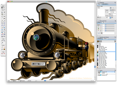
The partnership between the two companies continued with Altsys developing FreeHand and with Aldus controlling marketing and sales. After 1988, a competitive exchange between Aldus FreeHand and Adobe Illustrator ensued on the Macintosh platform with each software advancing new tools, achieving better speed, and matching significant features. Windows PC development also allowed Illustrator 2 (aka, Illustrator 88 on the Mac) and FreeHand 3 to release Windows versions to the graphics market.


