LIST OF WORKS

Your Sign Chooser page.
NGS signage is the most cost-effective marketing investment you can have.
Our Sign Service List below will help make it special.

‘We absolutely love our sign Nick!”
Helen Mellor.
David Mellor Design
List 1: London Classic Letters
A Beautiful collection of ‘New Traditional’ Styles


UP NEXT LIST 2 >>


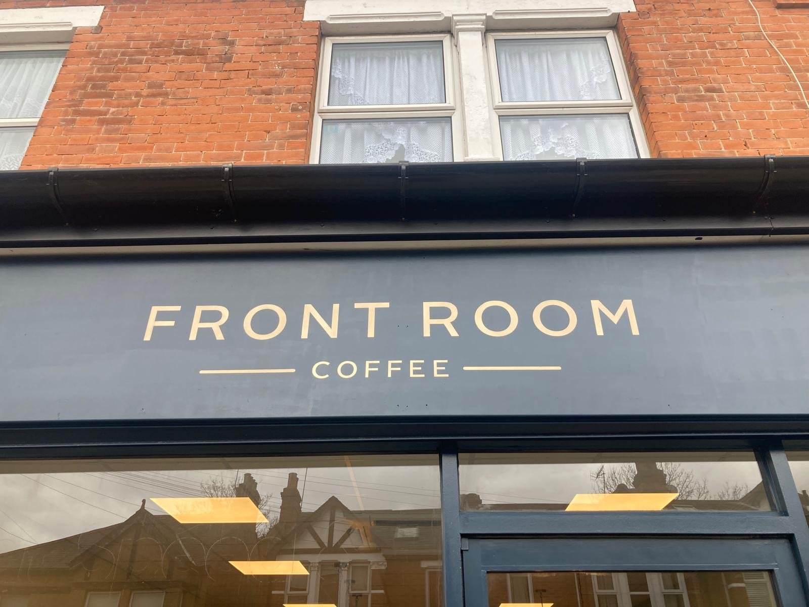
Soho to Shoreditch Coolest Shops


Heritage Retro Shops

- Price: List New


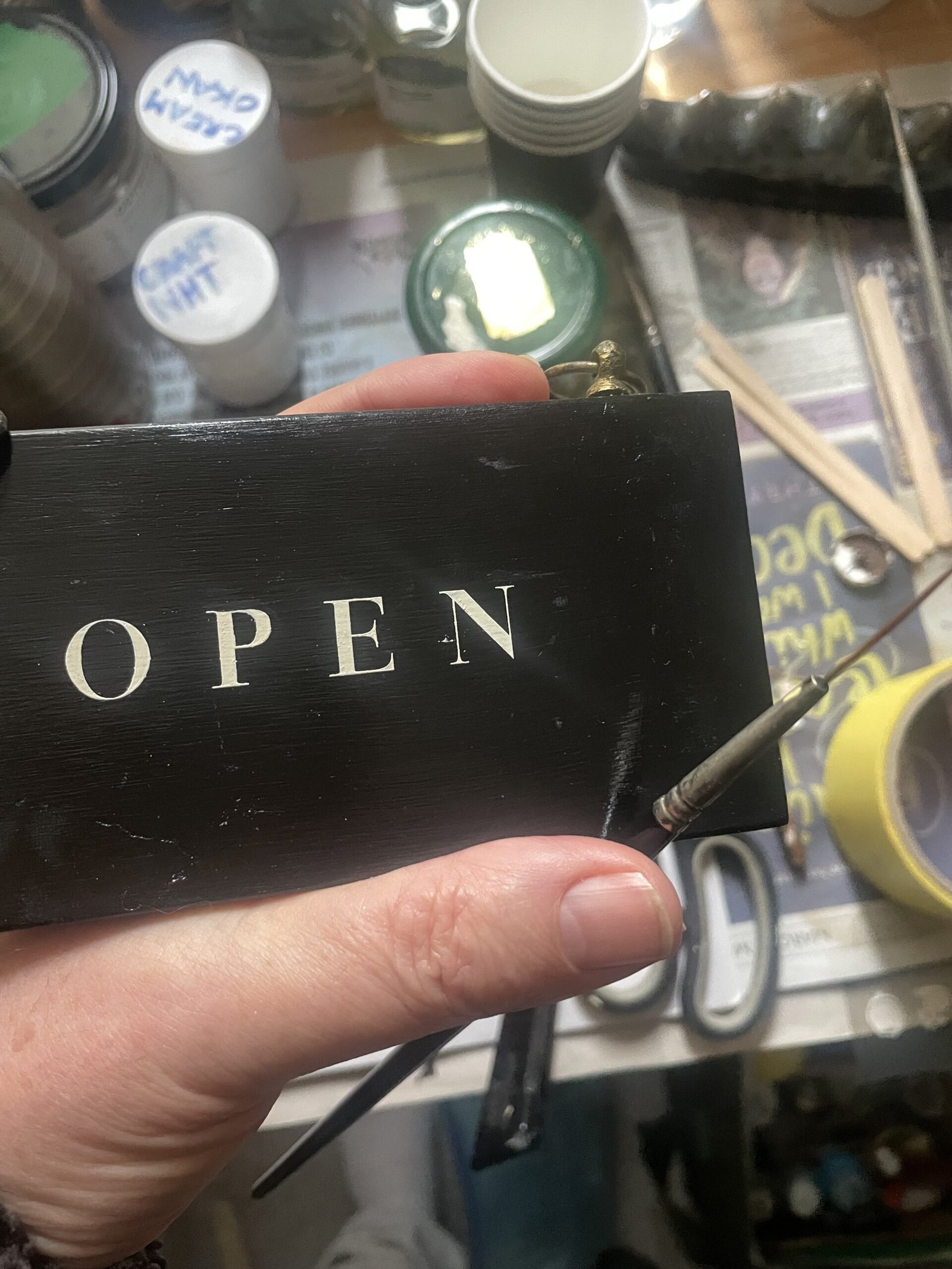
Gold Leaf & Glass Gilding
Creating coolest gold ID & strap lines

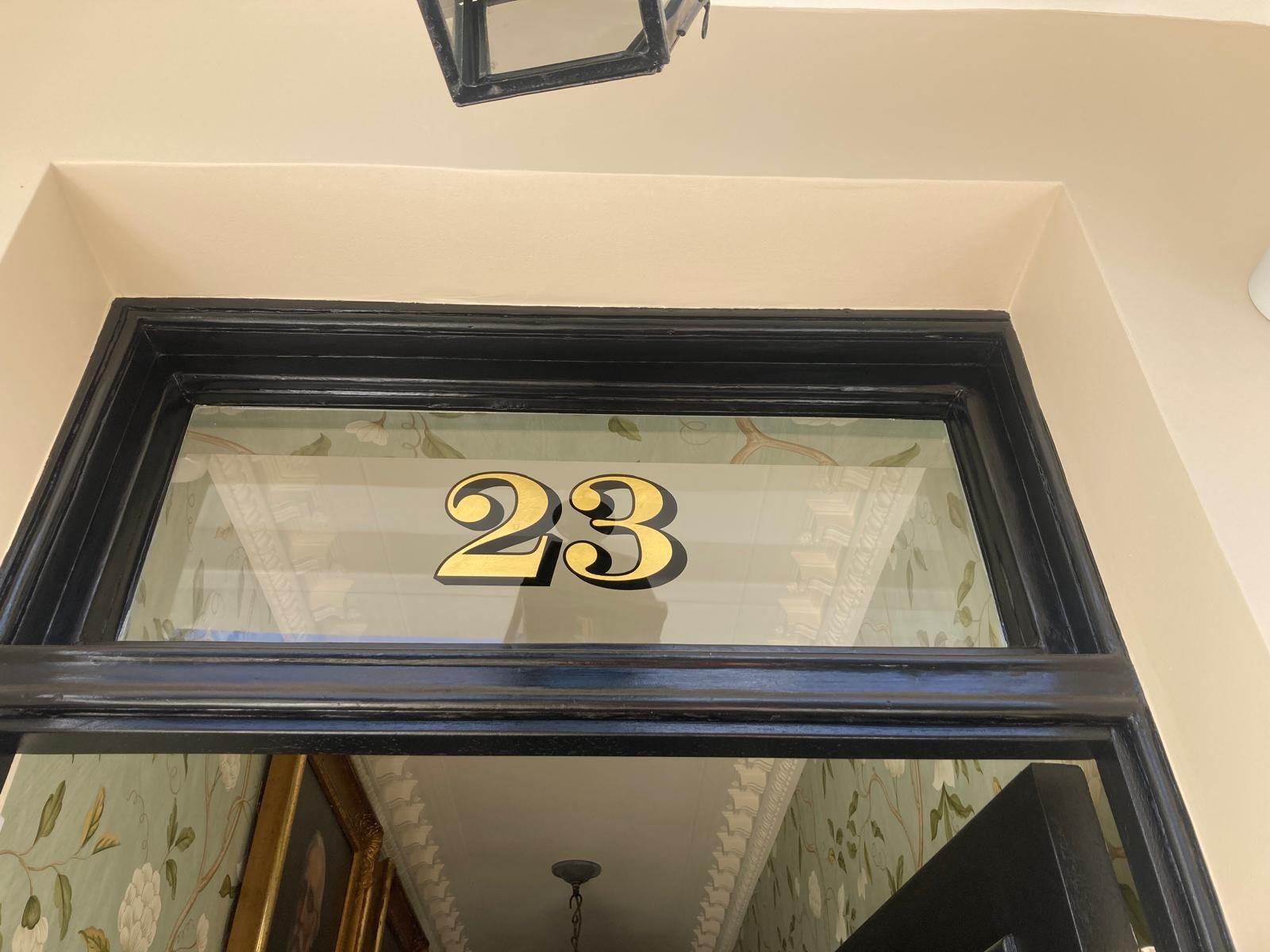
List 2: Bespoke House Numbers
Period correct. Distinct. Couture. Beautiful.

Heritage House Numbers & Titles


Gold+Black Numerals


Office & XL Walls
Wall art graphics, to inspire Leadership


- Ghost signs New
Minimalist Shops
For all Minimalist Boho Type fans.

Pure Graphic Design
We craft your powerful logo and Brand ID.

- NGS Logo Design New

ID Brand Design
We design for today’s successes & tomorrow’s Icons.
- NGS Brand design New
- NGS Custom Fonts By Design New
Design Contacts

NGS Case Histories
Amazing projects, from Tate to Barbour

Talk to us + Design Services
Keeping it simple + FAQs.
…and we respond super fast.


Serving the best clients in the world.
‘This is beyond amazing Nick”
Will Petty ‘Elsie’s Old World Delights’, Moab, Utah
NGS CAFE SIGNS